Best Font for a Resume: Readability and Export Checks
Choose a readable resume font, check size and consistency, and inspect PDF or DOCX exports. Includes a practical comparison and a no-tool review.
The best font for a resume is one the reader can comfortably scan and your document can reliably export. Common fonts such as Arial, Calibri, Aptos, or Times New Roman can work. There is no evidence here that one typeface produces more interviews or receives a universal ATS bonus.
Choose for the document you will send
Start with one available font for the body and use weight, size, and spacing to distinguish headings. A font that exists only on your computer may be substituted when another person opens the DOCX. A PDF can preserve appearance, but you still need to check text selection and reading order.
| Choice | Useful characteristic | Review concern |
|---|---|---|
| Arial or similar sans serif | Clear, familiar letter shapes | Dense text when spacing is tight |
| Calibri or Aptos | Practical in many Word workflows | Availability in other editors |
| Times New Roman | Familiar formal appearance | Small sizes can feel cramped |
| Decorative display font | Distinctive headings | Often unsuitable for body text |
Availability depends on the editor and device. Do not install a paid font just to satisfy a generic resume tip.
Set a readable size before shortening content
Try approximately 11–12 points for body text as a starting point, then inspect the actual output at normal zoom. The suitable size depends on the font and page. If the resume overflows, remove low-value repetition before shrinking all text. A readable second page can be more useful than an unreadable first page.
Use bold for section labels rather than styling every skill differently. Keep contact information in ordinary text. Decorative symbols should not replace an email address, job title, or meaningful section label.
A practical export test
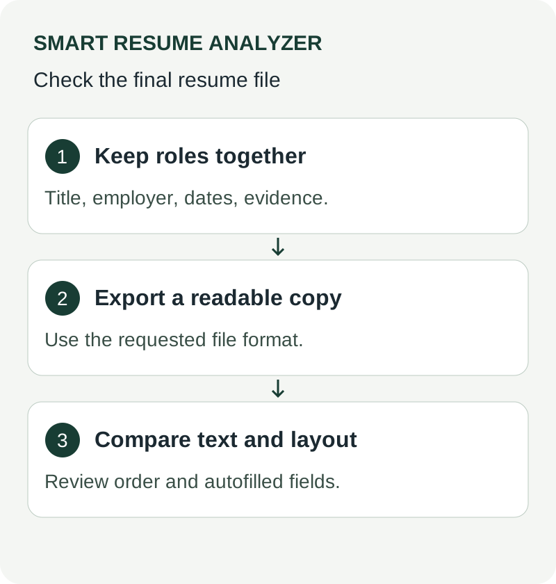
Save a copy in the format requested by the employer. Open that file in a second viewer if available. Select and copy the contact line, one heading, and a work-history block into a plain-text editor. Confirm the words are complete and appear in the intended order.
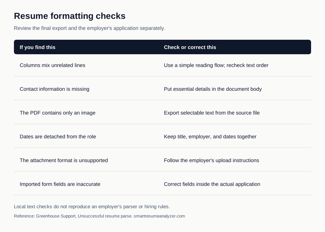
Then check a narrow screen and a printed or print-preview page. Look for clipped dates, substituted characters, and a sign-off or heading stranded at the page edge. Compare the result with the ATS formatting checklist. This review checks readability; it cannot certify compatibility with every employer's parser.
Sources and further reading
Use These Tools Next
Use a working tool to apply this guidance to your own resume or job description.
Related Resume Pages
Explore related keyword and resume guidance pages to keep improving your application materials.
Using this guidance
Use these guides to check a specific part of your application. Automated feedback is guidance, not a hiring prediction. Check suggested edits against your own experience.
Related Articles
Continue with another guide on this topic.
Resume Tools
AI Resume Analyzer vs Resume Checker vs Resume Scanner: What Job Seekers Are Really Looking For
Searches for AI resume analyzer, checker, scanner, screener, resume analyser, cv analyzer, and AI resume screening free usually reflect one goal: better ATS readability and clearer edits.
AI & Technology
AI Resume Analyzer 2025: Understanding ATS Systems and Resume Optimization
AI resume analysis is most valuable when it speeds up revision loops and points to better edits, not just better scores.
Resume Tools
AI Resume Analyzer vs Resume Builder: What Job Seekers Actually Need
Resume builders help you create a draft. Resume analyzers help you improve one. Job seekers usually need both at different moments.